library(rio)
library(dplyr)
library(scales)
data=import("data/MDb Top Rated Titles.xlsx")

data=data %>%
filter(!is.na(type)) # removemos valores perdidos en la variable typeClase teórica Semana 11
tabla_porcentajes= data %>%
  count(type) %>%
 mutate(porcentaje = n / sum(n) * 100)  # Calculamos el porcentaje
tabla_porcentajeslibrary(ggplot2)
ggplot(tabla_porcentajes, aes(x=type,y=porcentaje, fill=type))+
geom_bar(stat = "identity")+
coord_flip()+
labs(title = "Gráfico de barras de porcentaje de peliculas por tipo",
x = "tipo",
y = "Porcentaje") +
geom_text(aes(label=round(porcentaje,1)), vjust=-0.3) +
theme_minimal() + # Tema minimalista
scale_fill_brewer(palette = "Set3") 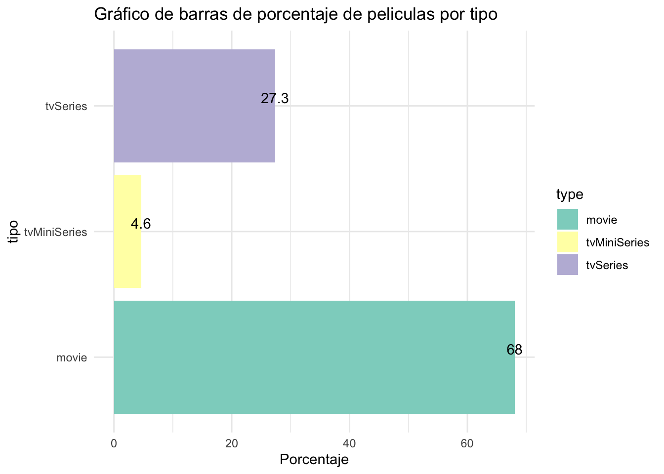
names(data)[1] "id" "title" "type" "genres"
[5] "averageRating" "numVotes" "releaseYear" tabla_edescriptivos=data%>%
summarise(promedio=mean(averageRating,na.rm=T),
mediana=median(averageRating,na.rm=T),
minimo=min(averageRating,na.rm=T),
maximo=max(averageRating,na.rm=T),
desviacion=sd(averageRating,na.rm=T))
tabla_edescriptivostabla_edescriptivos=data%>%
group_by(type)%>%
summarise(promedio=mean(averageRating,na.rm=T),
mediana=median(averageRating,na.rm=T),
minimo=min(averageRating,na.rm=T),
maximo=max(averageRating,na.rm=T),
desviacion=sd(averageRating,na.rm=T))
tabla_edescriptivoslibrary(ggplot2)
ggplot(data,aes(y=averageRating,x=type))+
geom_boxplot()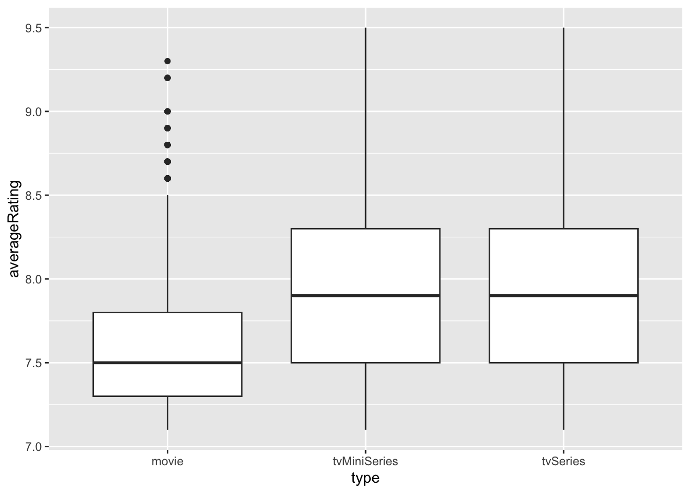
library(ggplot2)
ggplot(data,aes(y=numVotes,x=type))+
  geom_boxplot()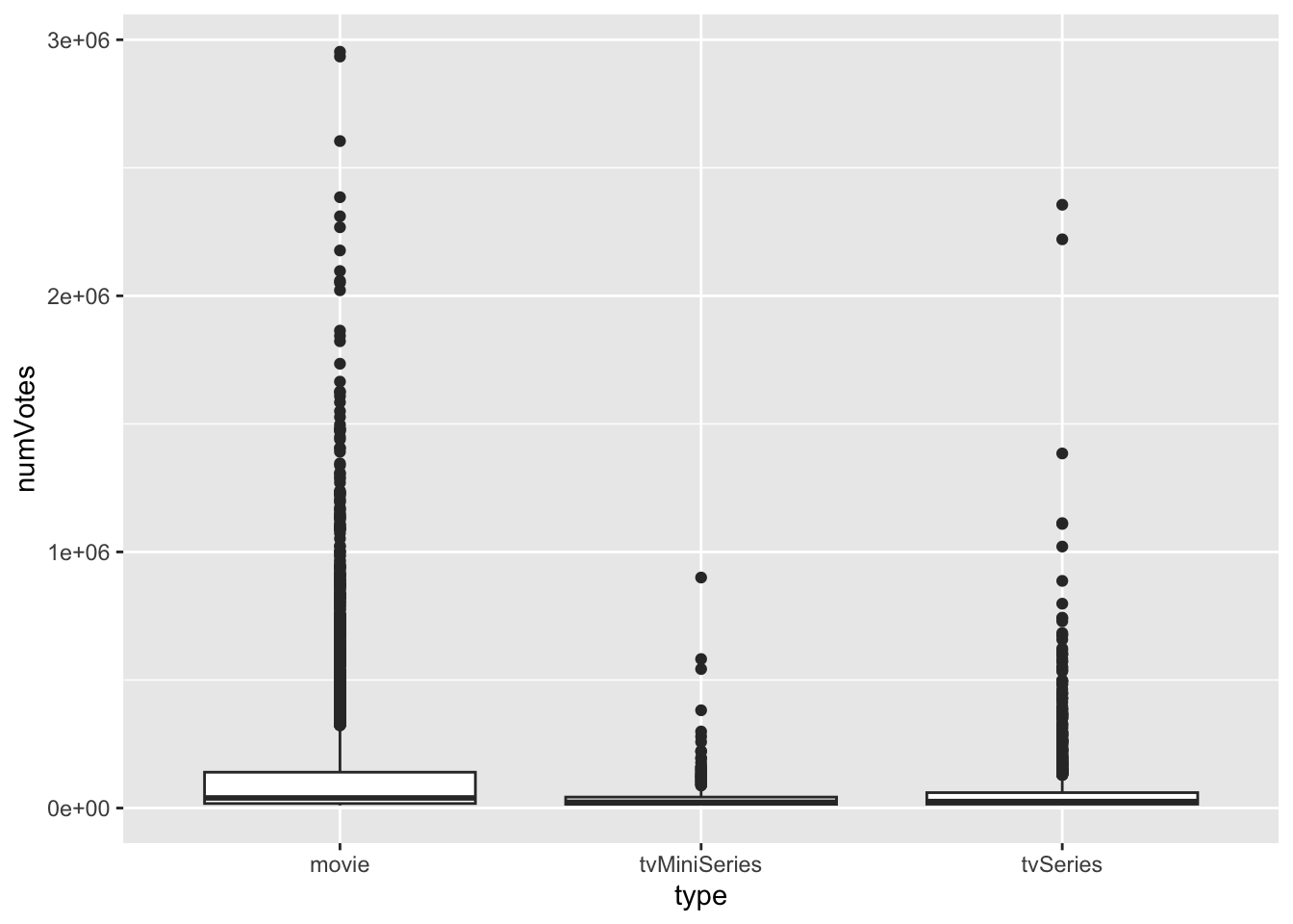
table(data$type)
       movie tvMiniSeries     tvSeries
4105 278 1650 ggplot(data, aes(x = averageRating, fill = type)) +
geom_histogram() +
facet_wrap(~ type, scales = "free") + # Divide en facetas por grupo
labs(title = "Histogramas de Variable Numérica por Grupo",
x = "Valor", y = "Frecuencia") `stat_bin()` using `bins = 30`. Pick better value with `binwidth`.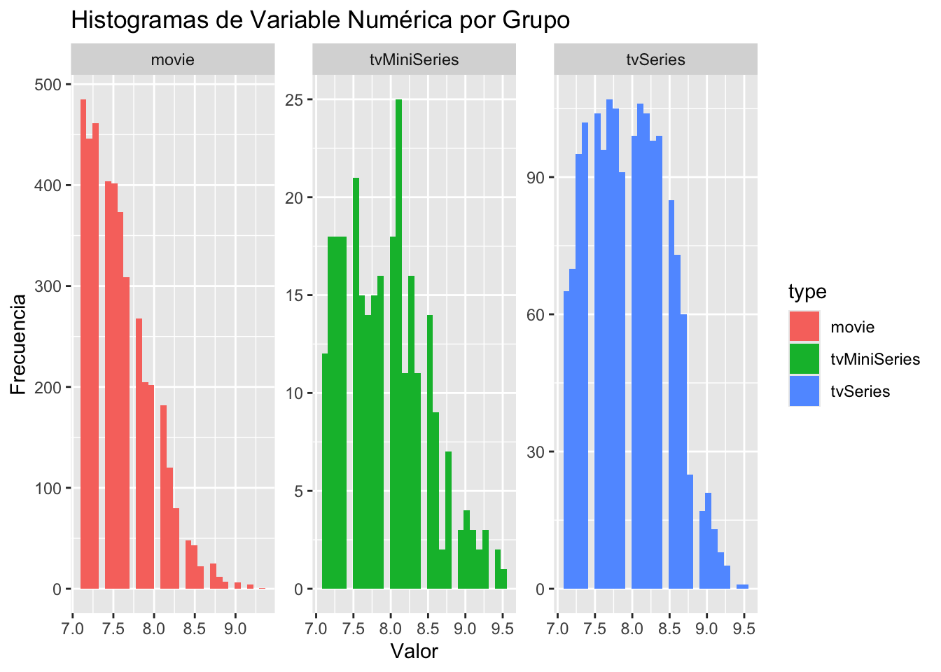
ggplot(data, aes(x = numVotes, fill = type)) +
  geom_histogram() +
  facet_wrap(~ type, scales = "free") +  # Divide en facetas por grupo
  scale_x_continuous(n.breaks = 3, labels = label_number()) + # especificar 2 cortes en eje x y evitar numeros en notacion cientifica
  labs(title = "Histogramas de Variable Numérica por Grupo",
       x = "Valor", y = "Frecuencia")
`stat_bin()` using `bins = 30`. Pick better value with `binwidth`.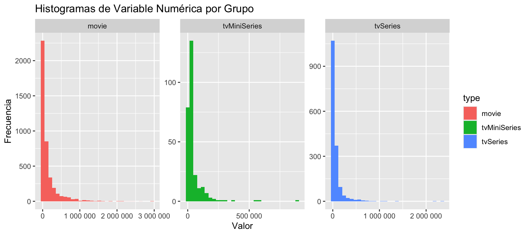
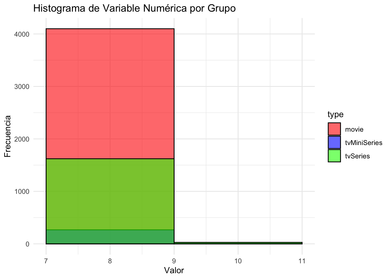
ggplot(data, aes(x = averageRating, fill = type)) +
  geom_histogram(binwidth = 2, alpha = 0.6, position = "identity", color = "black") +
  labs(title = "Histograma de Variable Numérica por Grupo",
       x = "Valor", y = "Frecuencia") +
  theme_minimal() +
  scale_fill_manual(values = c("movie" = "red", "tvMiniSeries" = "blue", "tvSeries" = "green"))  # Colores por grupo